
kay - time for the wrap up.
So we've discussed why you should care and all the important but small details that can go into making the space you live in your happy place - the place you come home to and let out that same audible sigh you let out when you walk into the really lovely hotel room. And if you've followed the steps outlined in these posts, you didn't even have to stress out very much about choosing colors or painting or anything of the sort. Because if you just followed the steps and sort of followed your heart and if you started with that great little piece of art...it just works. So a couple very last things I want to mention here, the finishing touches, and just a little bit more advice.
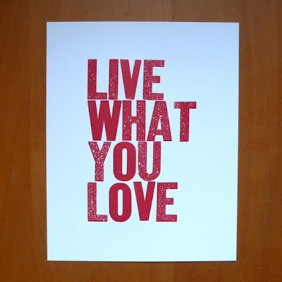
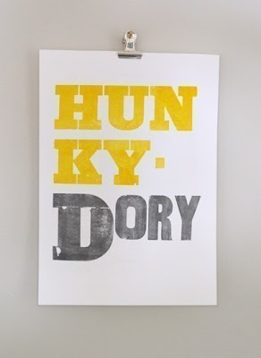
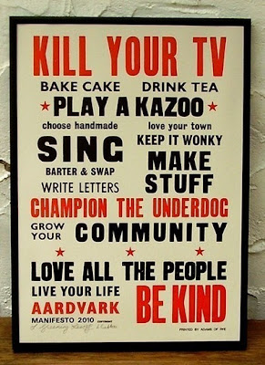
1. I told you how to find inexpensive artwork, and I told you I am not a fan of most mass produced posters and such, but I did make some exceptions and I'm going to show you a few examples of cool posters that are totally allowable and might be a great jumping off spot if you still haven't figured that part out (which is pretty key by the way):

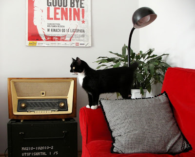
That last one is for a cool movie poster called "Goodbye Lenin" which is actually a polish film (which I've seen by the way, and which is quite good) cool foreign film posters are always a decent possibility, as are quirky American films that hardly anyone has seen, or if they did, they are cool people. "Ghost World" comes to mind - things like that - things that are a little fringey. Or really classic - maybe "Pillow Talk" or something like that. Such things can be found on the Internet.
2. Don't put up LAME photos of your family.
Now I didn't say you couldn't use ANY photos of your family. But please, please, please, don't put up some long row of photos or some wall of photos of your children, your parents, your wedding photos, etc. in your front or main room of your home. It is BAD design. I know you love your family. I know you love looking at them. I know you want to show them off. There is a time and a place. I offer a few tips. Hallways, or hallway collages or carefully constructed areas like that are good place to show them off - on top of a piano or a credenza or couch table. Honestly, I think school photos are just the worst. Take candids of your kids and blow up the ones you love. Or have someone else do it if you're not sure you can get good captures yourself. Normally I would say never use this as your main art work. I'll make a couple of possible exceptions - if it's really funny, or really good, or blown up really huge and funny AND good, then maybe. Here's one that I might consider of my own children. Consider - I'm still not saying I would do it, but if I were really poor and I couldn't find anything else I liked I might give these some thought:




Blown up on a wall, these have potential. The trick is to just capture your kids being...well, kids.
Sixx Design did something like this with their twins on one of their design walls and it works:
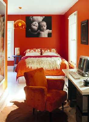 So I'm not saying you can't EVER do it, just do it thoughtfully and with purpose. AND NO SCHOOL PHOTOS PLEASE PLEASE PLEASE!!!!
3. Add some final touches - some personal things. Something that means something to you. I happen to dig dias de los meurtos and so I have some little skulls around in my front room. I have a small sculpture my husband carved, I have a little clay figure my son did, I have a little polished rock I bought that is in the shape of a heart, stacks of books that I happen to really like. Just little touches can make a big difference.

Doesn't this little munny sculpture my son did add just a touch of personality to the space? I love it. Just a few touches here and there that show it's about you.
5. I highly recommend an area rug to pull it together, whatever your flooring - wood, tile, faux wood, cement, painted cement, or carpet, an area rug can make a big difference. You can see mine in this photo:
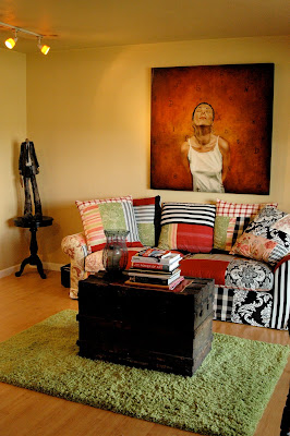
Again, this is an old photo and the room looks a little different now, but you get the point, it just pulls the colors together and gives it a warmer look, the carpet could be bigger than this for sure too. And this is like the 3rd carpet I've had in this room. I've noticed that they all last about 3 or 4 years tops. I'm not buying some expensive imported rug. These are all IKEA. That way I don't feel bad about replacing it. I went to dry-clean the last one and realized it would just be cheaper to go to IKEA and find a new one. So this is a last minute touch, but one that kind of adds that final finesse to your room and gives it that homey feeling that you're looking for.
WHEW...
I think we finally got through all these steps...
Now implement them one at a time, slowly, give yourself the time and the space to find the right things and you'll find that it all will come together nicely.
And the next thing you know, you'll have something gorgeous like this:
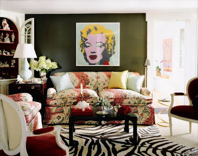
Let's face it that couch could have really gone over into ugly territory, the table is super simple and the chairs have been re-covered, the thing that is REALLY making this work is that Warhol print, which is cheap, add the zebra rug and a few personal items like that weird turtle candelabra and voila, you've got a cool room! Now don't you want to sink down into that couch and read a good book?
No comments:
Post a Comment