Wednesday, June 30, 2010

Lime


W

ho is this chick? I have no idea, but she's eating the right color of popsicle.

So today, some LIME inspiration:
I can honestly say I don't know if I've EVER loved a kitchen more than this. Nothing may ever compare ever again.

This is in a Trina Turk boutique...but I loved it so much, I had to add it anyway...

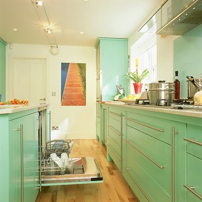
Admittedly, this is a little more minty than limey. A few things that I really love, first of all that EVERYTHING is the same, the dishwasher is the same surface color as the rest of the kitchen, the pull outs are something that I have in my kitchen and I love them! Also, that wood floor is gorgeous. I'm always really torn between a light wood and the darker wood floors. I think light wood is much more forgiving generally (especially since I have 3 dogs and kids) - dark floors show too much dirt and dusty prints. But I love how this has dark spots. Probably more forgiving than any wood floor I can imagine. (although light floors are more forgiving...NEVER do a white or an off white either - we used to have white tile and it was simply awful). I also really, really dig the drawer pulls.

Another gorgeous kitchen. Love the table and chairs too.

Yum, Yum, Yummy sofa. And leather (or fake leather) is the BEST when you have little kids and/or pets.

Great pop of lime color on the walls here and love all the alphabet letters too.

more subdued than a true lime but I love a lot of things here. What are those screens on the cabinet doors? I love them. Also, as you know by now if you've been looking at this blog at all - I'm a total sucker for these small mosaic tiles. I must have some someday somewhere. Very European with the faucet coming from the wall.

This is just crazy delicious.


Such a nice balance without going into Grandma or shabby chic territory. LOVE the floors.

Love this color, and all the white helps balance it and not make you feel like it is too crazy (by the way, I think my mother officially thinks I am insane after looking at my paint chips of green for my soon to be bedroom paint...she keeps saying "remember...colors make a room look smaller...she's very dubious...but this is a woman who doesn't have a non-white room in her house...she also told me that painting the ceilings colors is NOT what you're suppose to do unbeknownst me they are all suppose to be white. Who knew? She's going to die when she realizes I'm considering a slight pinkish hue on my ceiling)
A little stuffy, but lovely.
doing the chair rail so bold with the white on top is a good way to mitigate the effects of it being too green in a space that you think will be overwhelmed.

More popsicle summer inspiration to come!

Tuesday, June 29, 2010

Summer Popsicles....


B


anana Popsicles are the best flavor...in my humble opinion. Followed closely by Lime. Then Cherry, or Blue Raspberry if you can find them. Then Orange and Grape is definitely last. Actually to be fair, Rootbeer is probably my second fave, but since this post is going to parlay itself into a decor post, and I really don't like brown as a decor choice, I'm going to ignore my love of Rootbeer Popsicles for the our purposes here. (but they are darn tasty)


(making this particular box of popsicles my personal fave...)
Also (I realize I am on a tangent) there are these banana Popsicles that you can only get in Utah and Idaho that are creamy and delicious. They make them in chocolate too. I never understand why weird things like that are regional. Don't the people who make those Popsicles (I think they are made around Logan Utah) know that the good people of Arizona would love to buy their wares as well? I never understand random things like that...or how hard it is to get chocolate licorice here, but I digress...

So back to inspirational colors of summer, and for our first choice, in honor of banana, Yellow.

The other day on Design Star one of the girls was going on about "color theory" and that yellow is an aggressive color and you should never paint a room yellow because it isn't restful. I say poppycock. If you love yellow, paint a room yellow! I had a yellow front room and a yellow kitchen for years and I loved them. A friend of mine had a butter yellow all through her house and I thought it was VERY restful and peaceful. And currently half of my kitchen, front room and hall way are a odd yellow by Dunn Edwards called "Madera" and I think they are almost neutral and look lovely with the reds and greens. So if you like yellow, I say go for it!

Okay here are two rooms I love, which are really mostly white, but with that massive pop of yellow - it's just so HAPPY isn't it?

This is risky. But I really like it, and I like it with the pale green on the walls too. When we first moved into our 1952 home it had the UGLIEST insane asylum pink cabinets you've ever seen (in fact for some really weird reason the whole darn interior of the house was that color!) and I really could not afford to be changing out cabinets at first. But I agonized a little over what color to paint them. I thought white was just going to look darn ugly and the kitchen had virtually no natural light at all so going dark seemed like a bad option. Finally I settled on this Martha Stewart lemon yellow that I really loved. I painted the walls a slightly different yellow than the cabinets - the cabinets were just a tad bolder than the walls. I was pretty happy with the result. By the way, I love Dunn Edwards paint for the creaminess in application, and the lasting color - but a close second, and cheaper is Martha Stewart, which you used to have to get at Kmart or the Great Indoors, but which Home Depot just started carrying.

Crazy bold? Yes, but paired with the deep blues, it really works.

I am always a big fan of yellows paired with reds. Works every time.


Growing up my two favorite colors were yellow and green and my bedroom was yellow and green - LIME green and yellow. And guess what? That's kind of what I'm going for in my bedroom again. Which goes to show if you wait 20+ years your taste might circle back around to the same things again. Or I'm regressing. But don't you love them together?

There is a yellow here that really, really borders on orange, but I'm still calling it yellow. And it's really great.

love this with the raw wood. Also love that none of the chairs really match and the table is black. And the girl on Design Star said not restful? Craziness!


These are both very sophisticated with a good balance of neutrals (blacks and browns) along with the yellow. I like how on the one on top, you can tell that room is not very bright at any time during the day, but the yellow makes up for it. That's what I've noticed in my house. If you use yellow in a room that doesn't get a whole lot of natural sunlight, it sort of lets the sunshine in, naturally.

Okay that's it for today. Another summer day, another popsicle color.

Sunday, June 27, 2010

Sloooooow Progress

E

ver feel like you're getting no where fast? That's how I feel right now. Stretched a little thin - accomplishing a little of a lot of stuff, and not a lot of everything.

Last week I was at girl's camp all week in charge of the 14 year old girls. I really loved it, but I did wonder why I didn't just stay home and get a ton of stuff done while my two kids were at camp the same week!


However, it did look like this:

and even though I was busy pretty much the whole time, did not have time to study like I thought I would, nor even really read - I did enjoy nature and enjoyed getting to know the girl's that I had in my cabin. I was very impressed with each one of them as 14 year old girl's.

So...

Back to reality.

Right now we have swim team every morning and also junior life guarding and I'm endeavoring to finish some classes as well as take the kids hiking in the mornings. So we are very busy.

But I am STILL determined to work on my room project. You know how sometimes things get a lot messier and worse before they get better? Well, that's kind of how my soon to be new bedroom is right now....WAY worse before it's getting better.

So right now I am cleaning out millions of files trying to get everything organized and out of there, getting rid of stuff I don't need. Organizing taxes, etc. But I am still working on the general decor idea.

So...even though it has taken me forever! (It seems) this is my progress:


Okay so you can see where I've agonized over these color choices. I've basically decided on the one called "leprechaun" which...just the name makes me nervous! But I've analyzed it to death and it really is my favorite. And if by chance I hate it, I'll just paint over it I guess!

the painting is the one I did myself...I'm still working on some of the other art work ideas I had for in there. And the weird needlework ideas (which I'm actually really liking)


Okay when I was at Cucumberz I found this chair for $15. It's really sturdy, and already has a cool print on it. But if I do decide to recover it, it will literally take like no time at all and be super easy! I could also paint if I wanted but I haven't decided yet. The fabric on it is an old blanket I bought a million years ago at an antique store. It is a crazy quilt but has virtually no stuffing at all. I have wondered what to do with it for years, though I always really liked the bold colors of it. So...I am thinking about POSSIBLY making it my headboard for my bed.

I know! It might be insane. But I think it might be really cool.


Okay and currently in this room I am dealing with this mess. I wish I were one of those naturally organized people, but my brain just doesn't work that way! I'm trying!!! Have you ever taken one of those personality quiz's that distills your personality down into like 4 colors? It's really based on the Myers -Briggs, but it just makes it simpler to understand. So basically (and this is REALLY basic) - if you're a blue, then that means that feelings and emotions and people and things like that are the most important to you. And if you are Orange then you're kind of all about adventure and fun and rules are not super important to you at all...and sometimes if you're an orange you like to buck the system a little TOO much if you aren't careful, they are usually the "life of the party" type of person. Greens are very intellectual...they like to know how things work and to analyze things and they aren't usually much of a people person per se, they like to analyze everything a lot and they live in their heads a great deal. And Gold's are all about organization. Nothing makes them happier than a system and organizing anything pretty much. Or list making, etc. And nobody is totally ONE color, in fact, almost everyone has a little of each of those, just to different extents or levels. But one is usually the prominent color and then the others come after. So I am a Blue first, an Orange second, a Green third and a Gold Last. This doesn't bode well for keeping things organized. :)

My daughter is a Gold first, both my boys are probably tied between being a Blue and a Green first. So I am getting her to help me organize stuff. Because she is ALL ABOUT a system.

I'll keep you posted on my progress!

I am getting much better at list making and crossing things off. So I am making some strides.

Monday, June 21, 2010

New Photos Available

I added a few photos available to my imagekind store. I actually sold a few greeting cards this week, so that was cool. :) Soon I'm off to the wilds of the mountains for about a week so it will be radio silence around here for a while. Have a fantastic week!


Wednesday, June 16, 2010

Shine a Little Light

S


o...I'm basically busier than a one armed wall paper hanger. And frankly none of it is stuff I really WANT to be doing. What I really WANT to be doing is re-decorating around my house. But maybe if I get my priorities straight some of that can happen later in the summer. For now I am running kids to swim and doctors appointments and activities, trying to fit in a whole slew of homework and tests, trying to figure out why I said I would be a cabin mom and get all the prep work done I need for that. We're training a puppy and are now a 3 dog house (who's insane idea was that and why did I sign off on it?) Not to mention a slew of other random personal issues I have deal with. Oh and did I mention tax crap and going through millions of files? SO I'm really too busy to do any sort of cohesive blog post at the moment. But just because I have like 10 minutes to myself between task one and the pick up at the pool, I thought I'd share some inspiring lighting images I've been collecting.

I think sometimes light fixtures can totally MAKE a room. But they are often very overlooked in the design process - sort of an after-though. Oh and don't ever let your contractor chose your light. It seems like every time I get near the end of a project that I've had someone else work on the contractor will say 'oh and since you didn't chose a light I just picked this up' and inevitably it will be something hideous. My house was built in the 1950s before people thought much about overhead lights, almost all the rooms were lit with lamps, and I love lamps, but you've got to have some overhead light sometimes to add some penache. So I offer some inspiring images that I love, maybe you'll find something you love to - maybe all you need for your room to look new and interesting again is a coat of paint and new light fixture.

Also I changed the blog music to Bosa Nova, just because it's so darn retro-cool and will put you in the mood for summer.


Cute cool and CHEAP


Surprisingly there are several artists on etsy who do this bubble lamps and they are not all that expensive. I love, love love them.


Okay I'm sure this is pricey but this is one of my favorite bathrooms ever and that light just makes it.


Cute and cool lamps, AWESOME view.


I know, I'm obsessed with the bubble thing.


I love these because you can change them out all the time and the room looks totally different.


Adore!

I know, again...there's something very Chihuly-esque about them.


As I recall these people made this themselves. I love some of the ones that people use wine bottles to do. I've seen those in a lot of restaurants lately and they are very cool.

Okay - back to my REAL tasks....hopefully more time to tackle projects later....

Thursday, June 10, 2010

LinkWithin

Related Posts with Thumbnails