kay...so I am trying for a freelance position with an online blog and I have to do a sample house tour...and since my house has already been published, I have to do a different house.
A few friends have been kind enough to offer that I can come photograph their houses, and if I actually get the position, I would have to do several of these a month. So yesterday I took photos of a house in Phoenix that I really like - I especially love the outdoors of this house, and I might have to go back and take a few more photos because in retrospect, I am missing a few things that are kind of important (like a photo of the couch, none of which turned out well...or the baby's room) but ultimately I am going to have to narrow it down to 20. So here's where you come in, can you please tell me your favorites? You guys helped me out before when I did my own housetour and I'm looking for similar help here.
Please leave me a comment and let me know which you like the most...like I said, I may have to go back and take a few more - so also let me know if there's some aspect of the house that you feel is glaringly missing and that you wish you could see more of. So here they are:
Front Door 1

Front Door 2

Family Room 1

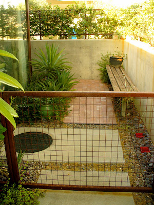
West Side Yard 1

West Side Yard 2

West Side Yard 3

Front of house 1

Front of house 2

Front of house 3

Front of house 4

Front of house 5

East side yard 1

east Side yard 2

Back yard 1

Back yard 2

Outdoor shower

Backyard 3

Backyard 4

Backyard 5

Backyard 6

Backyard 7

Backyard 8

Backyard 9

backyard 10

Kitchen 1

Master bedroom/bathroom

Master Bath

Master Bedroom 2

master bedroom 3

master bedroom 4

Office 1

Office 2

Kitchen 2

Kitchen 3

kitchen 4

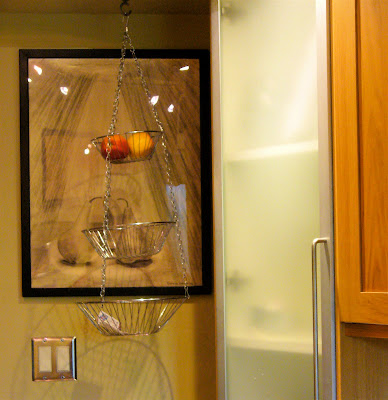
Kitchen 5

Family Room 2

Family Room 3

Kitchen 5

Kitchen 6

Family room 4

Entry water feature 1

entry water feature 2
 front of house 5
front of house 6

6 comments:
Broader context shots would give me a better sense of place orientation before focusing down on detail.
Ah! Ditto Adam.
Broader context is critical because w/so much cropping it felt like I was 'spying' in on these people instead of visiting their home. Others were frustrating because I wanted to see the edge of the counter and the cabinet fronts below the counter too, not just part of the counter.
ie: kitchen 3 & 4
kitchen 5 = Great! But a little more light on the inside; LOVE this window! -contrast too extreme; felt like a cave
kitchen 6 = Wonderful! Warm! Cozy! but want to see entire bookcase, OR maybe a SUPER close up at an extreme angle right next to the top row of items?
FR 1 Strat = Great! baby contraption (w/o a person WITH the baby) seemed kind of cold, cluttered and uncomfortable - like the baby was ignored in the corner. Baby on a blanket with toys would have been more appealing compared to awkward mechanical device that probably swings on a timer or something; speaks too much of a baby ignored
W side yard 1 = EXCELLENT view/angle thru gate is SUPER inviting
W side yard 2 = feels too hot/dry, not inviting
W side yard 3 = vine feels oppressive instead of green and lush
Front 2,3,4 = Excellent! Very inviting, wonderful perspective - feels spacious, urn is very pleasing/great contrast of clean lines next to natural surroundings, sewer cover detail fabulous!
Backyard 7 = Fountain good, but too cropped
Backyard 10 = Much better!!! but need the water spout visible to complete it
Mstr BR/BA = I felt like I was entering forbidden territory - is that a bare mattress or box spring at the bottom of their bed? And a spare pillow without a matching sham? Seems kind of careless rather than the "lived in" feeling. Consider a more expansive view of the bedroom, and an open book on the bed with reading glasses or something like that to convey people live there. I like the "kiss me sign", but maybe all by itself and uncropped
Office 1 = Felt like I was smacked in the face w/clutter even though I know it's tidy in there. Got to remove all the pictures from on top of the way cool wall organizers, and remove the calendars or cork boards or whatever are on the walls between the desk and wall things. 2 office chairs is 1 too many. Maybe just the angle of the shot would improve the feeling of being overwhelmed with stuff crammed into this nice space?
Entry Water Feature = Coolness! but my eye was frustrated to not see more in front of the bench
Front 6 = Very good, very clean-lined and inviting, spacious feeling even though the yard is actually small
Please keep in mind I totally suck at taking pictures. If you were to critique my home photo tour you would be kind to just tell me to hit 'delete' and ask someone else to man the camera (and clean up my house!)
I like West Side Yard 1, Front of house 1 2&5, and Backyard 4 7 9&10 the best
Okay I agree with the context idea but....
These people are letting me do this as a favor and it's totally instrusive - so...although it was 'cleaned up' they are very limited on space, the shots were taken the way they were to hide overly cluttery baby stuff everywhere, treadmill in the middle of front room - they just don't have enough space to put everything away somewhere.
Apartment Therapy does like you have a few 'establishment shots' to get perspective, but slideshows on housetours do tend to skew towards details so that really, I can go back and try to get maybe one or two longer shots, but that's about all I would want to submit. Their house - just because of the design and the size (under 1500 square feet, and no open space really) will just never read (look remotely artistic) with a long shot of anything.
So I appreciate that comment and probably will ask if I can sneak back in there to do a couple more shots, but I will still be limited to what I can accomplish.
I agree with the broader context comments, but I can see how that might not be possible. What about a broader shot of the kitchen?
Here are my favorites:
FR 1
West side yard 1, 2, 3
Front house 1, 2
East side yard 1
Backyard 1
outdoor shower (pretty cool!)
Backyard 4, 9, 10
Front room 2
Entry 2
You could totally do that. They have a really awesome yard. I only listed my very favorite shots, but I pretty much liked all of the outdoor shots.
Post a Comment