Sunday, February 19, 2012

Best Kids Room Ideas

I'm in a slow process of working on my  daughter Jordan's room.  Part of that process is just culling and getting rid of a lot of stuff before we can even really get started in there.  She recently re-did her room at her dad's house too and it turned out really well.  She's got a budding sense of style.  When kids get old enough, it is kind of fun to let them do the choosing and have a lot of say in what their space looks like.  I'll post some photos as they become available of her room here at my house (right now it just looks like a closet and a dresser exploded in there).  Here is a photo of her room at her Dad's house, she just needs some art work:


Here are some other great rooms for kids from the past few months - some little and some bigger.


Wednesday, February 15, 2012

What is Mid Century Modern?

I was talking to a friend the other day who asked, what exactly constitutes mid century modern.  I was surprised because the aesthetic of MCM has become so ubiquitous in the last few years, I thought everyone knew by now.   A lot of people throw around the term "modern" when what they probably really mean is contemporary.  Contemporary means "now", it's the fashion or the design of today.  "Modern" tends to refer more to something that happened at a moment in time.  Mid Century Modern happened right smack dab in the middle of the last century.  Think mid 1940s through 60s.

This design style has never totally gone out of style, though in the 70s people thought it looked "dated".  Some people with good taste never did get tired of it and it sort of evolved into a kind of Scandinavian design concept.

It's a lovely style full of clean lines and designer chairs and lots of linear feel.  It has the ability to be warm and austere all at the same time.

Here are some great examples of mid century design, and after the photos a re-cap of some of the recent posts (with links) I've done on particular styles of home design, all prompted by questions from blog readers and other who want to know what separates one style from another.

Your midcentury inspirational photos:


Other posts you might want to check out:

Shabby Chic

Hollywood Regency

Transitional Design

Primitive, Cottage & French/English Country


More to come in this series!

Saturday, February 11, 2012

Sophisticated Shabby - and yes, it's Chic

Lately a couple of people have told me that they like Shabby Chic, but they are worried about how to do it in a way that seems a little more sophisticated.  And it's true...some Shabby Chic can get the Shabby part right, but not so much the Chic.  And some Shabby Chic can quickly become Shabby Granny.  It's a style a lot of women are drawn to because it seems homey and cottagey.  But sometimes it loses a sense of sophistication in the process of all that homeyness.

Here are some reference photos of Sophisticated Shabby, and here's why they work:


First of all let's be honest, those two paintings make this room.  But I am of the opinion that any large scale artwork in a soft pallet could help sophisticate almost any Shabby Chic room.  I think the softness of the pallet has to remain or else you're wandering into other territory and straying from something that is an essential premise of Shabby.  But just the right notes of blue, pink, green, yellow or purples (or perhaps peach) in a large scale painting really add a great flavor to a room.  It kind of says "yes, I like to be comfortable, but I'm also smart and stylish"


What I like here is the shabby side table becomes just a little more sophisticated when that more mid-century chair is placed beside it with the more modern print on the pillow.  The light fixture keeps it all Shabby though, so there's no doubt of the intent.  


Can a colorful room with a mid century style fireplace be Shabby Sophisticated?  Well, yes, in this case I think it can.  The style of the furniture and an abundance of white and a mixing of pieces and lamps keeps this firmly in Shabby territory.  All the fun color makes it Chic and Sophisticated.  


Here, I'm again in love with mixing in the mid century stool, just that one thing really elevates this. I also love that they've kept things fairly clean and simple and they've let the outdoors coming in through the windows add the drama to the room rather than tons of accessories.  The globe is a nice touch too. 


Okay that glass jar/vase is awesome and would look good in any room, but it's really great here.  Look at how much texture is going on - that's why this totally white pallet really works.  Completely Shabby but completely Sophisticated too. 


what kind of struck me about this room is that it has an old world charm.  There aren't too many accessories and there is a restraint that is sometimes lacking in a Shabby Chic room.  


I love this and to be honest, it's BARELY Shabby, I probably should be calling it more transitional, but I think all the white, plus the peek in to the other room beyond, keep it just inside the Shabby territory. 
It's a great kitchen.  


Here we're nearly crossing into a kind of French provincial or english cottage look, but again, with the color pallet we stay with Shabby.  Don't be afraid to mix woods, but at the same time you have to be careful to keep the tones on the light side using only a few darker pieces. 


Those doors as headboard are really great. 


Again, more color than we usually associate with this style, but it still really works here because the background is kept light.  (all the sunshine helps too)


This is nearly transitional too - but because of the style of the furniture, I think still fairly Shabby by intention.  


Just really pretty and simple.  Even though a lot of Shabby Chic tends to pile on the layers and the accessories, if you hold back a bit, it gets a lot more sophisticated looking.  


I think there are lots of people out there who feel like Shabby Chic is kind of over - but I feel like it can stay current as long as you follow some of these tips.  And over-all, you have to like your space.  You should never plan your decor around what you think is "hip" at the moment.  Live in a space that feels like home and reflects something about who you are!  

Friday, February 10, 2012

Making Your Walls Happy - Art Placement and Scale

I love thinking about different ways to hang art and display images on walls.  And I'm not talking about hanging it "properly" at eye level (which IS important...) but rather, the way that you use art in a room to make an impact or a statement, lend a sense of élan, or provoke some poetic thoughtfulness.

Here are some great finds of late:


Why this works so well:  In this understated and slightly industrial room, your eye is completely drawn to this painting full of feeling and personal meaning.  It keeps the room warmer than it would be otherwise.  But at the same time, the neutrals of the painting allow the room to remain monochromatic as the owner intends.  Monochromatic rooms have their own particular feel which is very thoughtful.  Besides that, it's a beautiful painting. 


Okay, what's great about this is, it's not a painting, but actually mostly sculpture or folk art work, but it all works so well together in this book case.  I love that each section is mostly one item by itself.  Can you see how each item would lose it's impact if they were paired with other items?  But this way they all stand out individually while making the room much more layered, textured, and interesting.  Plus the pop of green in the chair is great too.


The point here is that most people would not put that massive painting in this space - but actually, it's a genius idea.  The room seems so much bigger and so much more interesting because of it.  


This isn't for everyone, but I stumble across this image now and again, and I just really like the feel of this.  Probably because I like graffiti art and I actually have a triptych that reminds me of this.  AND I created my own collage that reminds me a little of this too.  I think it's great.  


Here they've gone for a pop of color in the painting in the midst of this huge white space.  That color becomes a very specific focus and really lends drama to the room.  It's also great that the painting is so big.  Don't be afraid to chose art work that completely covers a wall almost - especially if it's a small wall like this in a larger space.  But even sometimes in a small space, it works really well too.


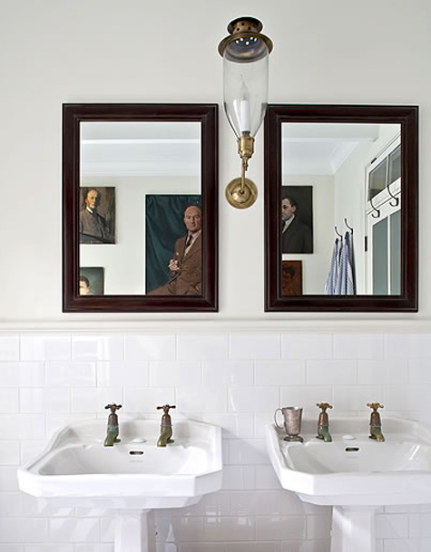
What I loved here is that you can only see the paintings in the mirror - but it's a very cool effect.  I also love these sort of austere looking dudes up on the wall in the bathroom.  Art in a bathroom should never be taken TOO seriously in my opinion.   I have some of my most fun art in the bathroom.


Here I love how the room is FULL of art.  And I also love that only one of the pieces of art work is really providing color in this neutral room.  It really has a nice effect.  It's okay to fill a space with art work if that's what you want to do. You just need to very carefully make decisions about how it will all fit together.


Love the bold color in this sunny room!  If you're scared of going too bold with painting your space, the art work can be bold in place of bold walls.


This is such a nice display.  But that blue just lends such a perfect note to this whole tableau doesn't it?


Okay seriously?  Is that George Michael, circa "Faith" up there on the wall?  Yes it is!  Can you display any more clear way to say, yes, I have a very serious home and yes, I have a very good sense of humor all in one space?  I don't think so.  This is simply awesome.


I love the juxtaposition of this wall, floor, chaise along with the neon Abe.  It just works.


This room would be totally boring without that one painting up there.  It was chosen for that spot because it forces you too look up and it creates a little well placed musical note in the room. 


Another great idea in a long hall way or along any long wall.  Trying to hang art in a space like this can be tough but displayed like this, with lots of things grouped together works really well.


I love neon art decor.  It tends to be pricey, but there have been times when I have been super tempted to purchase some.  You can occasionally get some through a student show - many art students on college campus' learn to use neon in their classes and it's a good way to find something like this for less than you would normally pay.  It just makes this room seem so much more fun than it would seem otherwise doesn't it?


Gorgeous color.  Even if you aren't a huge fan of abstract paintings, think about what a great way they bring drama to a space.  This type of painting is a nice way to dip your foot into the world of modern art without having to feel that you "understand" it.  It will grow on you if you let it.

LinkWithin

Related Posts with Thumbnails