I was talking to a friend the other day who asked, what exactly constitutes mid century modern. I was surprised because the aesthetic of MCM has become so ubiquitous in the last few years, I thought everyone knew by now. A lot of people throw around the term "modern" when what they probably really mean is contemporary. Contemporary means "now", it's the fashion or the design of today. "Modern" tends to refer more to something that happened at a moment in time. Mid Century Modern happened right smack dab in the middle of the last century. Think mid 1940s through 60s.
This design style has never totally gone out of style, though in the 70s people thought it looked "dated". Some people with good taste never did get tired of it and it sort of evolved into a kind of Scandinavian design concept.
It's a lovely style full of clean lines and designer chairs and lots of linear feel. It has the ability to be warm and austere all at the same time.
Here are some great examples of mid century design, and after the photos a re-cap of some of the recent posts (with links) I've done on particular styles of home design, all prompted by questions from blog readers and other who want to know what separates one style from another.
Your midcentury inspirational photos:
Other posts you might want to check out:
Shabby Chic
Hollywood Regency
Transitional Design
Primitive, Cottage & French/English Country
More to come in this series!
Wednesday, February 15, 2012
Saturday, February 11, 2012
Sophisticated Shabby - and yes, it's Chic
Lately a couple of people have told me that they like Shabby Chic, but they are worried about how to do it in a way that seems a little more sophisticated. And it's true...some Shabby Chic can get the Shabby part right, but not so much the Chic. And some Shabby Chic can quickly become Shabby Granny. It's a style a lot of women are drawn to because it seems homey and cottagey. But sometimes it loses a sense of sophistication in the process of all that homeyness.
Here are some reference photos of Sophisticated Shabby, and here's why they work:
First of all let's be honest, those two paintings make this room. But I am of the opinion that any large scale artwork in a soft pallet could help sophisticate almost any Shabby Chic room. I think the softness of the pallet has to remain or else you're wandering into other territory and straying from something that is an essential premise of Shabby. But just the right notes of blue, pink, green, yellow or purples (or perhaps peach) in a large scale painting really add a great flavor to a room. It kind of says "yes, I like to be comfortable, but I'm also smart and stylish"
What I like here is the shabby side table becomes just a little more sophisticated when that more mid-century chair is placed beside it with the more modern print on the pillow. The light fixture keeps it all Shabby though, so there's no doubt of the intent.
Can a colorful room with a mid century style fireplace be Shabby Sophisticated? Well, yes, in this case I think it can. The style of the furniture and an abundance of white and a mixing of pieces and lamps keeps this firmly in Shabby territory. All the fun color makes it Chic and Sophisticated.
Here, I'm again in love with mixing in the mid century stool, just that one thing really elevates this. I also love that they've kept things fairly clean and simple and they've let the outdoors coming in through the windows add the drama to the room rather than tons of accessories. The globe is a nice touch too.
Okay that glass jar/vase is awesome and would look good in any room, but it's really great here. Look at how much texture is going on - that's why this totally white pallet really works. Completely Shabby but completely Sophisticated too.
what kind of struck me about this room is that it has an old world charm. There aren't too many accessories and there is a restraint that is sometimes lacking in a Shabby Chic room.
I love this and to be honest, it's BARELY Shabby, I probably should be calling it more transitional, but I think all the white, plus the peek in to the other room beyond, keep it just inside the Shabby territory.
It's a great kitchen.
Here we're nearly crossing into a kind of French provincial or english cottage look, but again, with the color pallet we stay with Shabby. Don't be afraid to mix woods, but at the same time you have to be careful to keep the tones on the light side using only a few darker pieces.
Those doors as headboard are really great.
Again, more color than we usually associate with this style, but it still really works here because the background is kept light. (all the sunshine helps too)
This is nearly transitional too - but because of the style of the furniture, I think still fairly Shabby by intention.
Just really pretty and simple. Even though a lot of Shabby Chic tends to pile on the layers and the accessories, if you hold back a bit, it gets a lot more sophisticated looking.
I think there are lots of people out there who feel like Shabby Chic is kind of over - but I feel like it can stay current as long as you follow some of these tips. And over-all, you have to like your space. You should never plan your decor around what you think is "hip" at the moment. Live in a space that feels like home and reflects something about who you are!
Friday, February 10, 2012
Making Your Walls Happy - Art Placement and Scale
I love thinking about different ways to hang art and display images on walls. And I'm not talking about hanging it "properly" at eye level (which IS important...) but rather, the way that you use art in a room to make an impact or a statement, lend a sense of élan, or provoke some poetic thoughtfulness.
Here are some great finds of late:
Okay, what's great about this is, it's not a painting, but actually mostly sculpture or folk art work, but it all works so well together in this book case. I love that each section is mostly one item by itself. Can you see how each item would lose it's impact if they were paired with other items? But this way they all stand out individually while making the room much more layered, textured, and interesting. Plus the pop of green in the chair is great too.
Here they've gone for a pop of color in the painting in the midst of this huge white space. That color becomes a very specific focus and really lends drama to the room. It's also great that the painting is so big. Don't be afraid to chose art work that completely covers a wall almost - especially if it's a small wall like this in a larger space. But even sometimes in a small space, it works really well too.
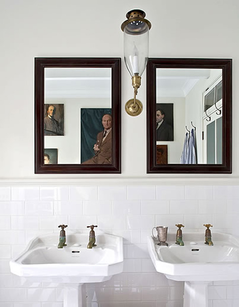
What I loved here is that you can only see the paintings in the mirror - but it's a very cool effect. I also love these sort of austere looking dudes up on the wall in the bathroom. Art in a bathroom should never be taken TOO seriously in my opinion. I have some of my most fun art in the bathroom.
Here I love how the room is FULL of art. And I also love that only one of the pieces of art work is really providing color in this neutral room. It really has a nice effect. It's okay to fill a space with art work if that's what you want to do. You just need to very carefully make decisions about how it will all fit together.
This is such a nice display. But that blue just lends such a perfect note to this whole tableau doesn't it?
Okay seriously? Is that George Michael, circa "Faith" up there on the wall? Yes it is! Can you display any more clear way to say, yes, I have a very serious home and yes, I have a very good sense of humor all in one space? I don't think so. This is simply awesome.
I love the juxtaposition of this wall, floor, chaise along with the neon Abe. It just works.
Another great idea in a long hall way or along any long wall. Trying to hang art in a space like this can be tough but displayed like this, with lots of things grouped together works really well.
I love neon art decor. It tends to be pricey, but there have been times when I have been super tempted to purchase some. You can occasionally get some through a student show - many art students on college campus' learn to use neon in their classes and it's a good way to find something like this for less than you would normally pay. It just makes this room seem so much more fun than it would seem otherwise doesn't it?
Gorgeous color. Even if you aren't a huge fan of abstract paintings, think about what a great way they bring drama to a space. This type of painting is a nice way to dip your foot into the world of modern art without having to feel that you "understand" it. It will grow on you if you let it.
Here are some great finds of late:
Why this works so well: In this understated and slightly industrial room, your eye is completely drawn to this painting full of feeling and personal meaning. It keeps the room warmer than it would be otherwise. But at the same time, the neutrals of the painting allow the room to remain monochromatic as the owner intends. Monochromatic rooms have their own particular feel which is very thoughtful. Besides that, it's a beautiful painting.
Okay, what's great about this is, it's not a painting, but actually mostly sculpture or folk art work, but it all works so well together in this book case. I love that each section is mostly one item by itself. Can you see how each item would lose it's impact if they were paired with other items? But this way they all stand out individually while making the room much more layered, textured, and interesting. Plus the pop of green in the chair is great too.
The point here is that most people would not put that massive painting in this space - but actually, it's a genius idea. The room seems so much bigger and so much more interesting because of it.
This isn't for everyone, but I stumble across this image now and again, and I just really like the feel of this. Probably because I like graffiti art and I actually have a triptych that reminds me of this. AND I created my own collage that reminds me a little of this too. I think it's great.
Here they've gone for a pop of color in the painting in the midst of this huge white space. That color becomes a very specific focus and really lends drama to the room. It's also great that the painting is so big. Don't be afraid to chose art work that completely covers a wall almost - especially if it's a small wall like this in a larger space. But even sometimes in a small space, it works really well too.
What I loved here is that you can only see the paintings in the mirror - but it's a very cool effect. I also love these sort of austere looking dudes up on the wall in the bathroom. Art in a bathroom should never be taken TOO seriously in my opinion. I have some of my most fun art in the bathroom.
Here I love how the room is FULL of art. And I also love that only one of the pieces of art work is really providing color in this neutral room. It really has a nice effect. It's okay to fill a space with art work if that's what you want to do. You just need to very carefully make decisions about how it will all fit together.
Love the bold color in this sunny room! If you're scared of going too bold with painting your space, the art work can be bold in place of bold walls.
This is such a nice display. But that blue just lends such a perfect note to this whole tableau doesn't it?
Okay seriously? Is that George Michael, circa "Faith" up there on the wall? Yes it is! Can you display any more clear way to say, yes, I have a very serious home and yes, I have a very good sense of humor all in one space? I don't think so. This is simply awesome.
I love the juxtaposition of this wall, floor, chaise along with the neon Abe. It just works.
This room would be totally boring without that one painting up there. It was chosen for that spot because it forces you too look up and it creates a little well placed musical note in the room.
Another great idea in a long hall way or along any long wall. Trying to hang art in a space like this can be tough but displayed like this, with lots of things grouped together works really well.
I love neon art decor. It tends to be pricey, but there have been times when I have been super tempted to purchase some. You can occasionally get some through a student show - many art students on college campus' learn to use neon in their classes and it's a good way to find something like this for less than you would normally pay. It just makes this room seem so much more fun than it would seem otherwise doesn't it?
Gorgeous color. Even if you aren't a huge fan of abstract paintings, think about what a great way they bring drama to a space. This type of painting is a nice way to dip your foot into the world of modern art without having to feel that you "understand" it. It will grow on you if you let it.
Labels:
art,
home decor
Wednesday, February 08, 2012
Finding your Style - Jules Reid
As part of the "home cure" we are doing with a group of women I know from church, one assignment is to find your own personal sense of style. For some people this is easy and for others it presents a challenge.
How do we find something that is very specific and personal to us when so many of us shop in the same stores and see the same stuff all the time?
I think it's one of the main reasons so many people end up going with a look that looks a lot like everyone else.
It's why so many homes are decorated in their entirety from Pottery Barn. And hey, I'm not putting that down - I like to stroll through pottery barn as much as the next person, and almost inevitably there will be some thing there that I will like, but it does kind of reduce everything to a common denominator (for sure you know you're going to see that mirror you bought or that vase or that lamp in lots of other homes).
One assignment of this task was to analyze your personal tastes - questions like "who is your favorite actress" or "fave actor" or "type of music" or a - what is your personal sense of style from a fashion stand-point? These things can reveal a lot about who we are and in turn, they can help us really pin point what it is that speaks to us the most deeply - and what we want to surround ourselves with - and how we can create a home that reflects something important about ourselves, which feels authentic and great.
I'm realizing as I'm talking to lots of people who are working on this right now - that many people have trouble with these types of questions. And then they have trouble translating that from things that they love to how that would reflect in a space.
I thought maybe today I would share one example and then maybe in a different post on a different day (when i can get time! because life is crazy busy right now!) I could talk about how a questionnaire about tastes and likes and dislikes in multiple areas of our lives that seemingly have little to do with decor, actually can help you create decor you love.
But to simplify initially -
Sometimes something just grabs your eye. Maybe you're shopping for clothes, or maybe you're just wandering through the mall, or perusing a magazine, or looking at some stuff online and something will just stick out to you. And you'll say to yourself "ooooo I REALLY like that". When that happens, stop and think for a minute. why do you love it? Is it the color? The design? The texture? The lines? Is it practical? Flattering? Why are you so drawn to this thing? I promise, if you can stop yourself in that moment you'll learn a lot about what you love. I'm not talking about when you're looking for a black shoe and you find a black shoe that you like and you get happy because it's been hard to find one with the right heel and the right fit and the right look. No. That's not it at all. I'm talking about when you WEREN'T looking and something just jumped out at you.
So let me share one of these moments for myself:
The designer Jules Reid says she views her designs as part gypsy part jet setter, part 60s pool inspired.
Well YES and YES and YES and I love these:
Do I dress like this? No, only in my fantasy version of myself (which is a version that is thin enough to pull off caftans without looking like Mrs. Roper) - but I am incredibly drawn to it nonetheless. And who knows, maybe someday if I have an extra $795 burning a hole in my pocket, maybe I'll buy a hot pink caftan coat by Jules Reid. But the point is that realizing this is something I'm drawn to - the colors, the bold, the patters. It says something important about what I really like.
The trick is to combine all of these things we like into some kind of comprehensible whole.
More on that later.
What are you drawn to? What speaks to you? What would you wear if money and other random factors were non-issues? What does the fantasy version of yourself wear?
How do we find something that is very specific and personal to us when so many of us shop in the same stores and see the same stuff all the time?
I think it's one of the main reasons so many people end up going with a look that looks a lot like everyone else.
It's why so many homes are decorated in their entirety from Pottery Barn. And hey, I'm not putting that down - I like to stroll through pottery barn as much as the next person, and almost inevitably there will be some thing there that I will like, but it does kind of reduce everything to a common denominator (for sure you know you're going to see that mirror you bought or that vase or that lamp in lots of other homes).
One assignment of this task was to analyze your personal tastes - questions like "who is your favorite actress" or "fave actor" or "type of music" or a - what is your personal sense of style from a fashion stand-point? These things can reveal a lot about who we are and in turn, they can help us really pin point what it is that speaks to us the most deeply - and what we want to surround ourselves with - and how we can create a home that reflects something important about ourselves, which feels authentic and great.
I'm realizing as I'm talking to lots of people who are working on this right now - that many people have trouble with these types of questions. And then they have trouble translating that from things that they love to how that would reflect in a space.
I thought maybe today I would share one example and then maybe in a different post on a different day (when i can get time! because life is crazy busy right now!) I could talk about how a questionnaire about tastes and likes and dislikes in multiple areas of our lives that seemingly have little to do with decor, actually can help you create decor you love.
But to simplify initially -
Sometimes something just grabs your eye. Maybe you're shopping for clothes, or maybe you're just wandering through the mall, or perusing a magazine, or looking at some stuff online and something will just stick out to you. And you'll say to yourself "ooooo I REALLY like that". When that happens, stop and think for a minute. why do you love it? Is it the color? The design? The texture? The lines? Is it practical? Flattering? Why are you so drawn to this thing? I promise, if you can stop yourself in that moment you'll learn a lot about what you love. I'm not talking about when you're looking for a black shoe and you find a black shoe that you like and you get happy because it's been hard to find one with the right heel and the right fit and the right look. No. That's not it at all. I'm talking about when you WEREN'T looking and something just jumped out at you.
So let me share one of these moments for myself:
The designer Jules Reid says she views her designs as part gypsy part jet setter, part 60s pool inspired.
Well YES and YES and YES and I love these:
Do I dress like this? No, only in my fantasy version of myself (which is a version that is thin enough to pull off caftans without looking like Mrs. Roper) - but I am incredibly drawn to it nonetheless. And who knows, maybe someday if I have an extra $795 burning a hole in my pocket, maybe I'll buy a hot pink caftan coat by Jules Reid. But the point is that realizing this is something I'm drawn to - the colors, the bold, the patters. It says something important about what I really like.
The trick is to combine all of these things we like into some kind of comprehensible whole.
More on that later.
What are you drawn to? What speaks to you? What would you wear if money and other random factors were non-issues? What does the fantasy version of yourself wear?
Labels:
color,
fashion,
happiness,
home decor
Wednesday, February 01, 2012
Brad Goreski - Putting the Rad in Brad
I'm not a newcomer to my love of Brad Goreski. I've been hearting on him since his first season on Rachel Zoe. I like watching Rachel's show but it suffered from a serious lack of Brad this past season.
Brad is like every great thing about boys and fashion all wrapped up into one little cute package. He's adorable and irresistible. Honestly, find me someone who can resist the charms of this guy, because if you can find me that person, I'll show you a horrible mean ogre.
Brad seems like a genuinely nice boy. In that especially specific Canadian kind of way that he has about him. Like he's totally fabulous and totally normal - except totally not - all at the same time.
He someone manages to combine the retro vibe of a by-gone era while embracing a certain 80s moment and at the same time bringing us solidly into what is NOW in 2012 and beyond.
Look, I don't know what it is about me that I am drawn to these characters. But they make me happy. Brad's show on Bravo makes me happy - but more than that, just seeing him out and about in his loud happy bright colors makes me happy too.
I almost embarrass myself with my embrace of such things.
I'm a 44 yr old mother of 3 with lots of stuff on my plate to think about besides Brad Goreski.
But you know,
That's never really stopped me from being an embracer of silly things, and appreciating them immensely.
if you're not watching Brad on it's a BRAD BRAD WORLD on Bravo, you should maybe check it out.
Brad is like every great thing about boys and fashion all wrapped up into one little cute package. He's adorable and irresistible. Honestly, find me someone who can resist the charms of this guy, because if you can find me that person, I'll show you a horrible mean ogre.
Brad seems like a genuinely nice boy. In that especially specific Canadian kind of way that he has about him. Like he's totally fabulous and totally normal - except totally not - all at the same time.
He someone manages to combine the retro vibe of a by-gone era while embracing a certain 80s moment and at the same time bringing us solidly into what is NOW in 2012 and beyond.
Look, I don't know what it is about me that I am drawn to these characters. But they make me happy. Brad's show on Bravo makes me happy - but more than that, just seeing him out and about in his loud happy bright colors makes me happy too.
I almost embarrass myself with my embrace of such things.
I'm a 44 yr old mother of 3 with lots of stuff on my plate to think about besides Brad Goreski.
But you know,
That's never really stopped me from being an embracer of silly things, and appreciating them immensely.
if you're not watching Brad on it's a BRAD BRAD WORLD on Bravo, you should maybe check it out.
Subscribe to:
Posts (Atom)